BIGELOW TEA PACKAGING
This project is a rebrand of Bigelow Tea packaging. The original packaging blended in with all other tea products on store shelves and had no connection to Bigelow as a brand. I redesigned Bigelow Tea using inspiration from the Bigelow family’s heritage, company history, and the locations of their globally sourced ingredients.
The new packaging is distinct and sticks out amongst its competition on the shelves, complete with a gold signature and a wax seal. I completed all processes of this project, from design to printing and constructing the final package.


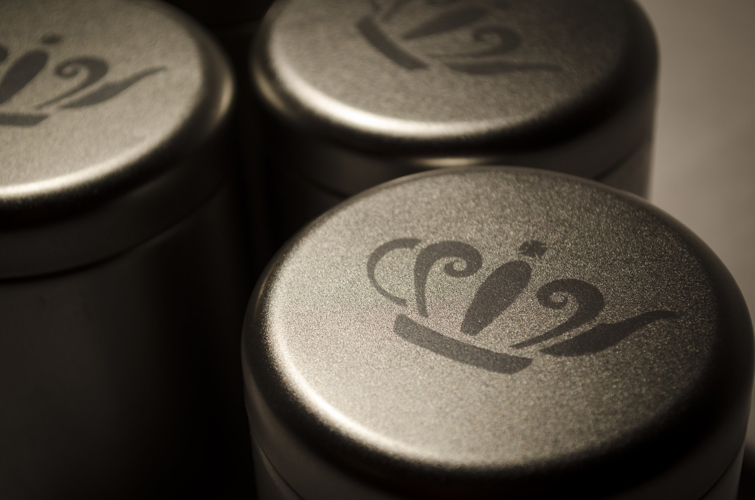
A logo that speaks to both the Bigelow family's British heritage and their tea product.


Designed to look like a mail package to embrace how Bigelow's ingredients are sourced from all over the world and brought to store shelves.

A wax seal holds the entire package together. The seal is the Bigelow Family Crest.


Hand-drawn, hand-painted, and tea-stained mail stamps, customized for each flavor depending on the location that the unique ingredient to that flavor came from.
When the Bigelow family first started making tea back in 1945, they had to quickly hand-paint all of their labels the night before bringing their tea to the market because they could only afford single-color printing. I wanted to embrace this piece of company history and bring the hand-painted touch back into the Bigelow brand.

Oil of Bergamot in Earl Grey sourced from Italy.

Hibiscus in Berry Hibiscus sourced from Malaysia.

Mango in Mango Lily sourced from Sri Lanka.

Hand-signed with a gold pen - the Bigelow family signature.

